
.png)
Designer Insight: Crafting the Nexora Brand Identity
In the ever-evolving tech landscape, Nexora sought a brand identity that would capture its innovative essence while maintaining a sleek, futuristic appeal. Our approach at A2 Design Lab was rooted in balancing cutting-edge aesthetics with a sense of reliability and trust—key attributes for any forward-thinking technology brand.
Concept & Visual Language
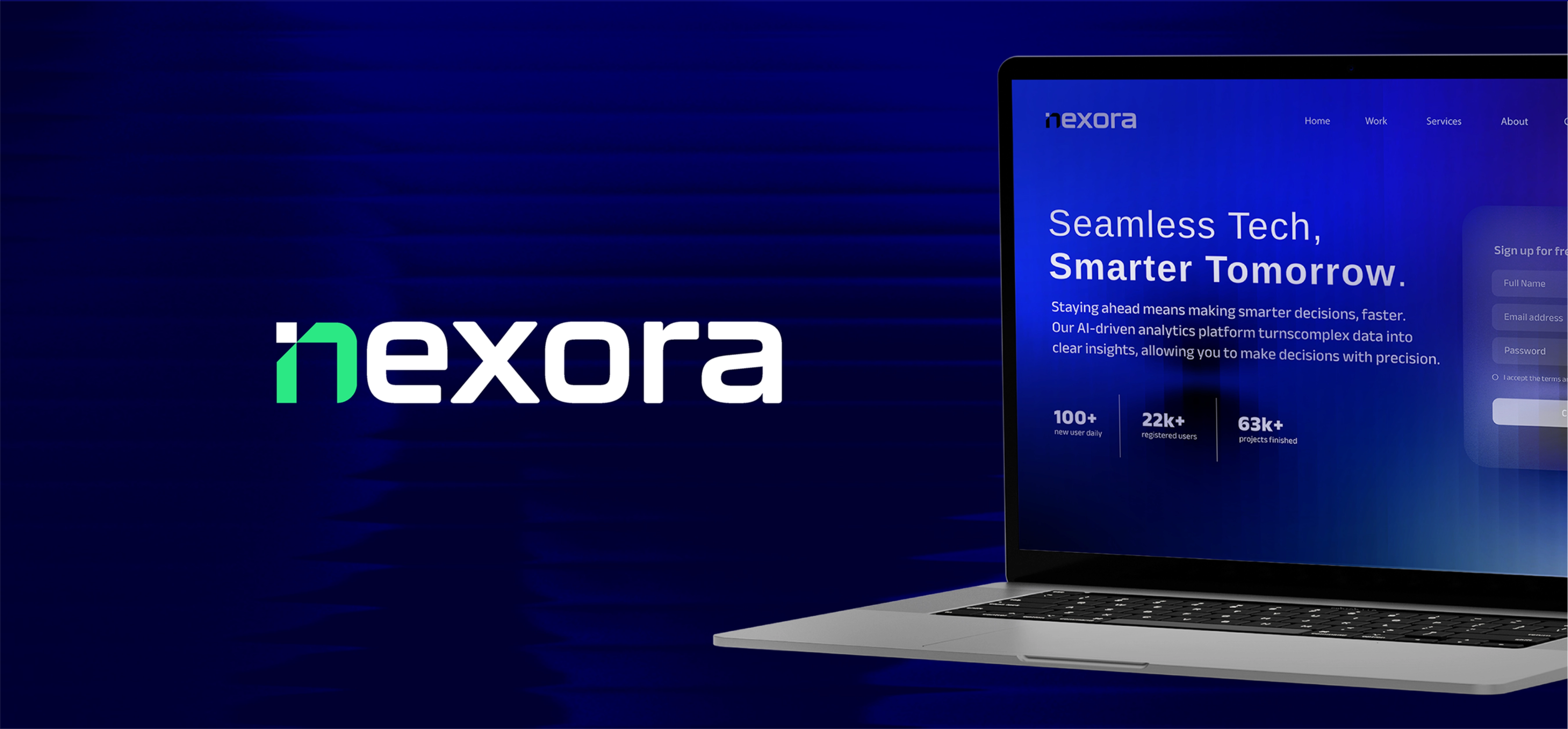
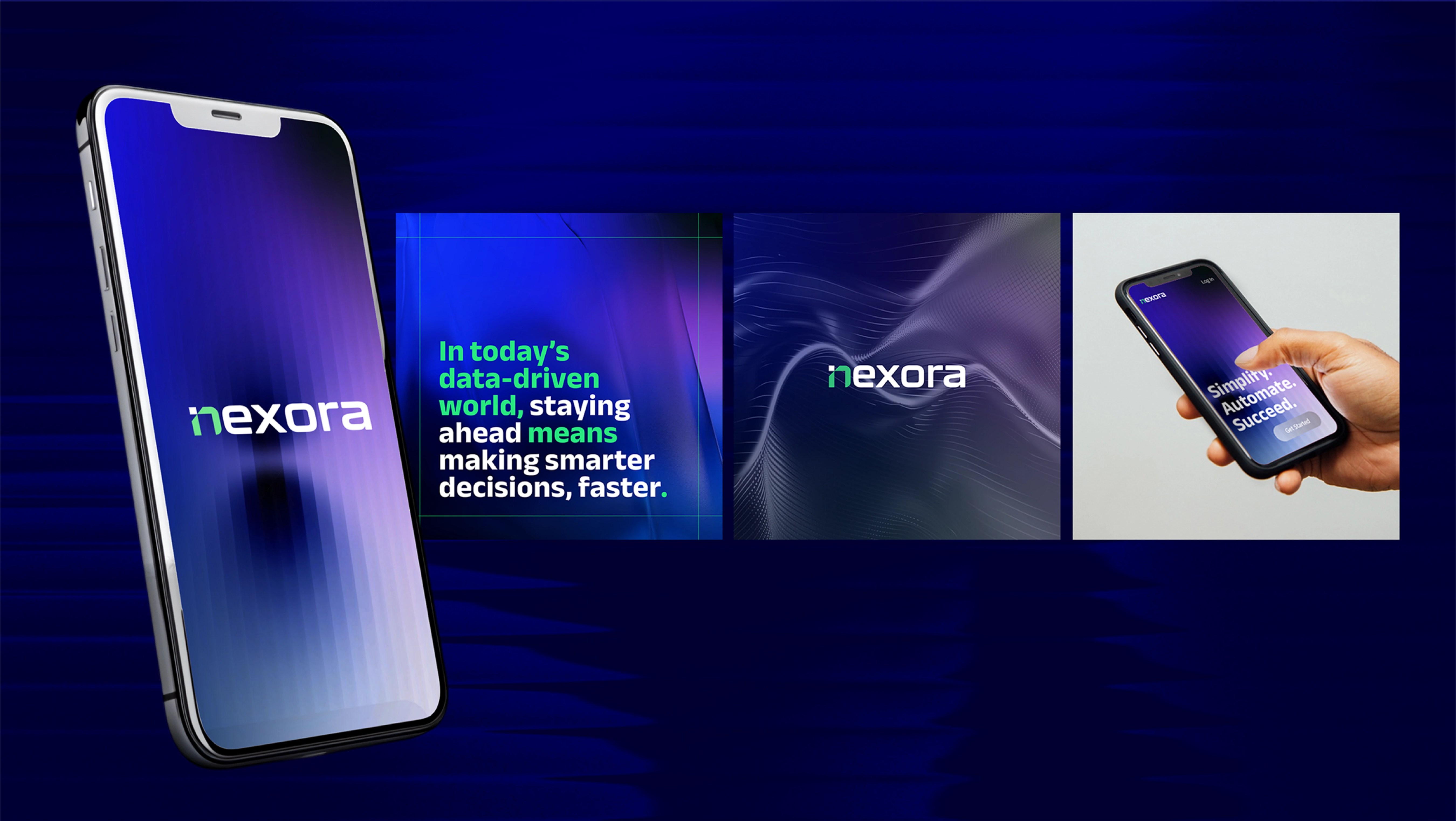
Our primary goal was to create a brand experience that felt both high-tech and approachable. The visual direction was inspired by digital fluidity, geometric precision, and a clean, modern aesthetic. We employed a refined color palette with deep blues and vibrant neon accents, evoking a sense of intelligence and dynamism.
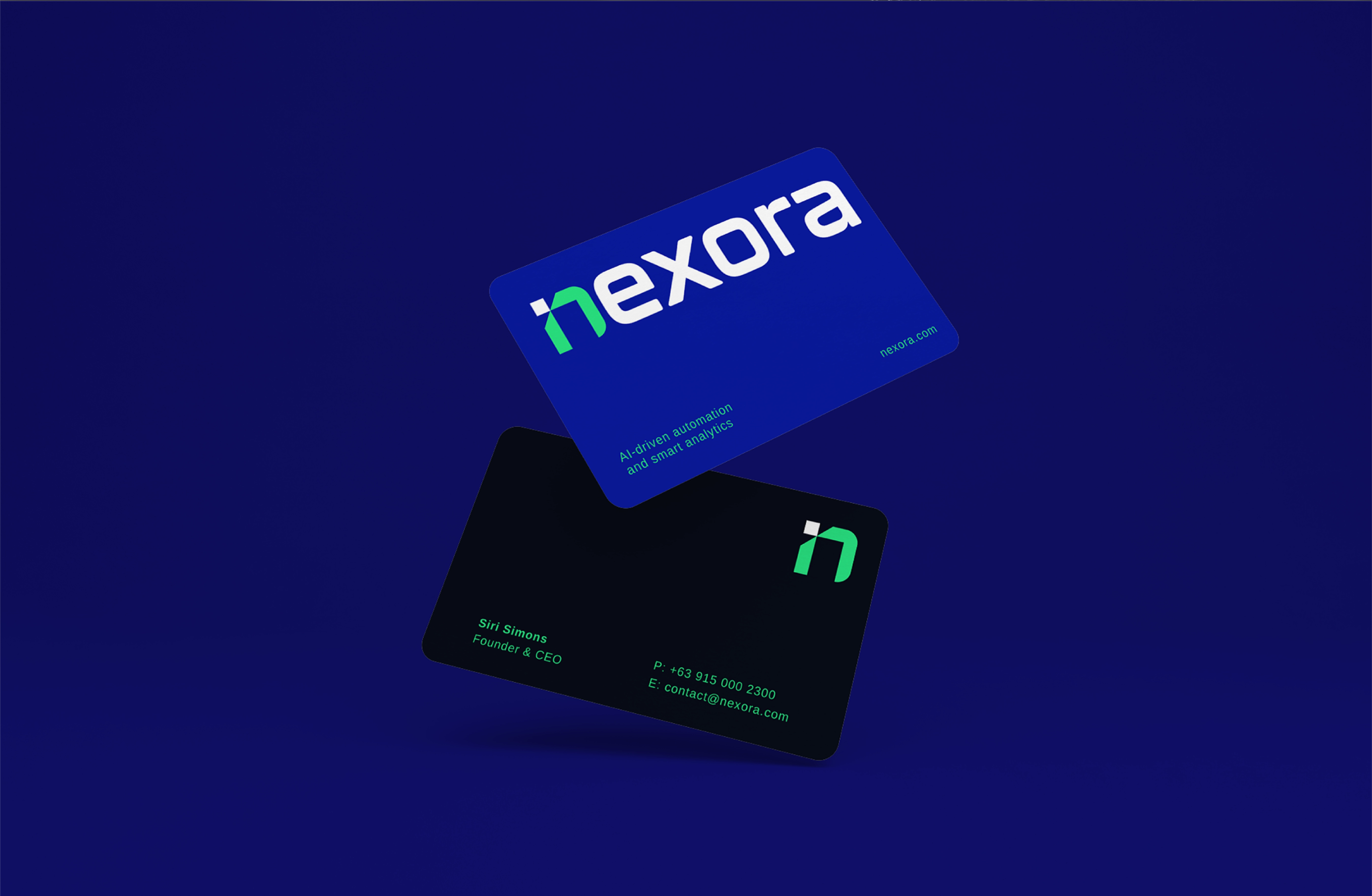
Typography played a crucial role in establishing Nexora’s identity. We opted for a bold, sans-serif typeface that conveyed strength and clarity, ensuring legibility across various digital and print mediums. The logo design, structured yet fluid, symbolizes the brand’s adaptability in an ever-changing digital space.
Design Execution & Application
From web design to marketing materials, every touchpoint was meticulously crafted to maintain consistency. The use of minimalistic UI elements and interactive features on the website ensures a seamless user experience while reinforcing Nexora’s forward-thinking ethos. We also incorporated subtle motion graphics, enhancing engagement without overwhelming the viewer.
The Takeaway
Nexora’s brand identity embodies the intersection of innovation and accessibility. By leveraging a cohesive design language, we successfully positioned Nexora as a leader in the tech space—one that is not only cutting-edge but also approachable and user-centric.
At A2 Design Lab, we believe that great design is about storytelling, and Nexora’s identity is a testament to how visuals can shape perception and create lasting impact.