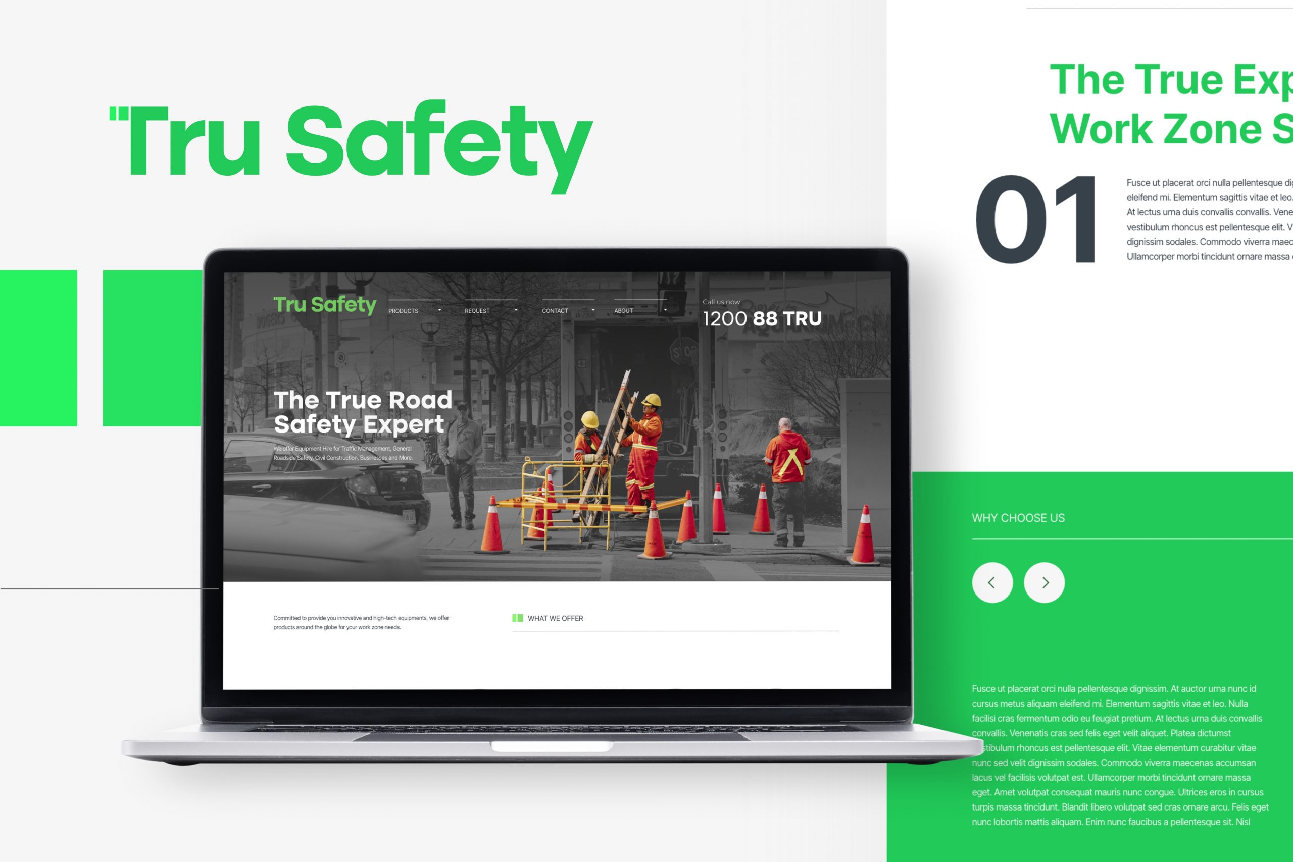
Tru Safety
As a design firm, one of our main priorities is to understand our client’s needs and goals and find ways to communicate those through design. For our project with Tru Safety, we wanted to create a website that accurately reflects the company’s values and mission.
To accomplish this, we conducted extensive research on the rental industry and the target audience of Tru Safety. We also talked to the team at Tru Safety to understand what they wanted the website to communicate and what they wanted to be the main focus. From this research, it became clear that the main goal was to establish Tru Safety as a reliable provider of equipment rentals and to demonstrate their dedication to good customer relations.
Based on this insight, we decided to go for a minimalistic and outlined art style for the website. This design aesthetic is clean and simple, which is perfect for communicating a sense of reliability and attention to detail. By using a minimalistic design, we were able to create a website that is easy to navigate, and emphasizes the key information that visitors need to know about Tru Safety.
Additionally, By choosing not to use templates, we were able to make sure the website stands out from the competition and establish Tru Safety as a unique provider of equipment rentals. The unique user experience that we aimed to create, helps visitors to easily find the equipment they need and navigate through the website with ease, which can result in more conversions and satisfied customers.
Overall, we are confident that the website we designed for Tru Safety effectively reflects the company’s core values and mission. The site is thoughtfully crafted to showcase Tru Safety’s unwavering commitment to providing reliable and high-quality equipment rental services.


