Nevaeh Hand Nourishing Cream – A Blend of Nature & Care
Our goal was to redefine a hand cream that embraces nature’s way of nourishing the skin. We focused on pure, botanical ingredients to create a restorative skincare solution. The brand reflects the growing demand for plant-powered self-care, emphasizing natural and effective hydration. It is designed for consumers who want products that not only work effectively but are also gentle on the skin and the environment.
A Design Rooted in Nature
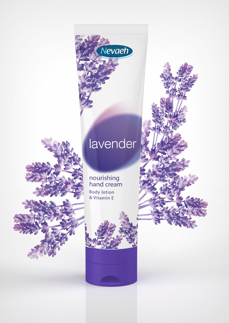
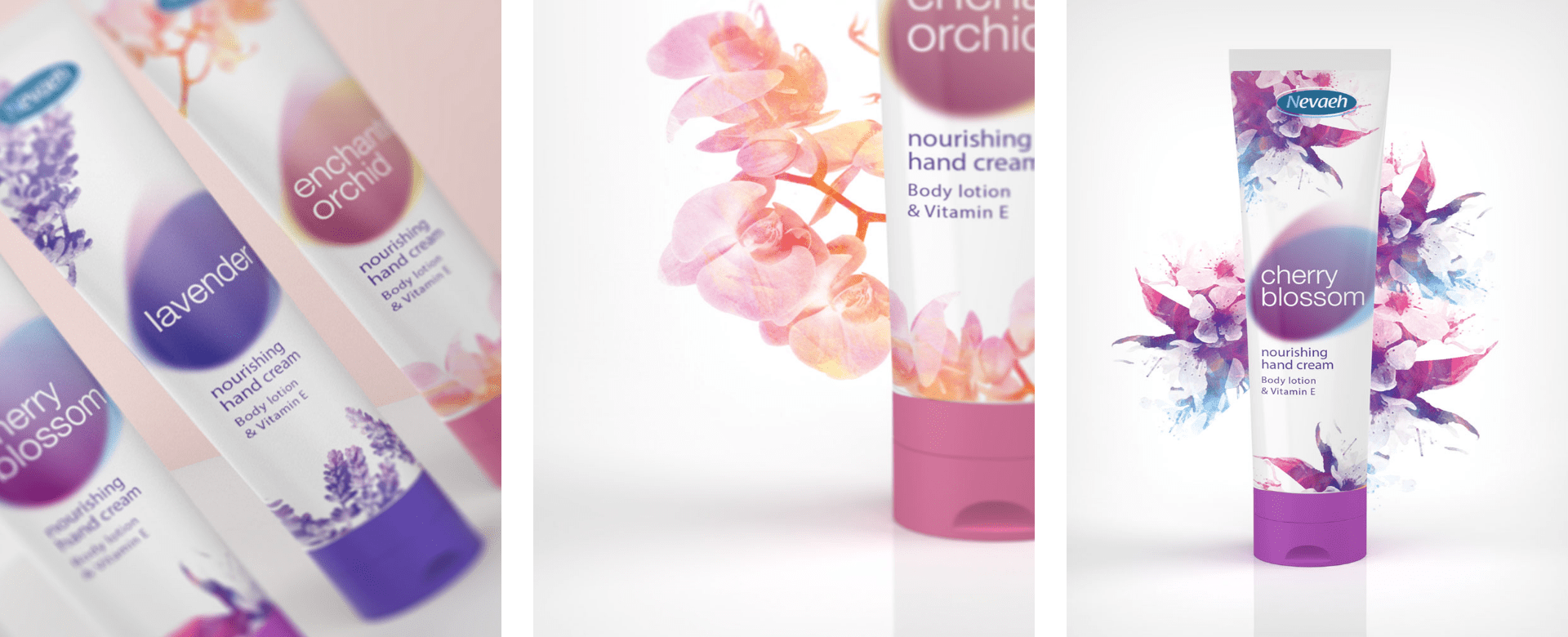
The visual identity of Nevaeh is inspired by nature’s ability to rejuvenate. Organic shapes and botanical elements highlight simplicity, purity, and sustainability. Floral and plant-based graphics reinforce the skin-nourishing benefits of the ingredients. These elements go beyond aesthetics—they tell a story of natural care and connection to the earth. Every detail, from the subtle floral illustrations to the earthy color palette, evokes a sense of purity. This emphasis on nature reassures customers that they are choosing products aligned with their values.
Minimalist & Elegant Packaging
The packaging design follows a clean, minimalist approach. Soft, nature-inspired colors and delicate floral illustrations evoke a sense of calm and sophistication. Each detail ensures that the product stands out while staying true to its botanical origins. The sleek design also makes it an elegant addition to any bathroom or vanity. The packaging is functional yet aesthetically pleasing, making it perfect for display while ensuring it is easy to use for daily application.


