.png)
For Inno Dental, A2 Design Lab created a branding design that embodies innovation and expertise, and showcases it in an exciting, contemporary style.
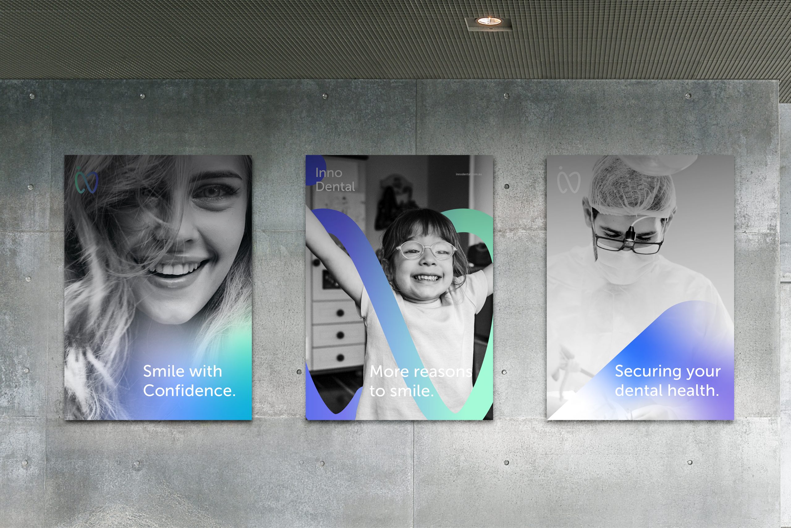
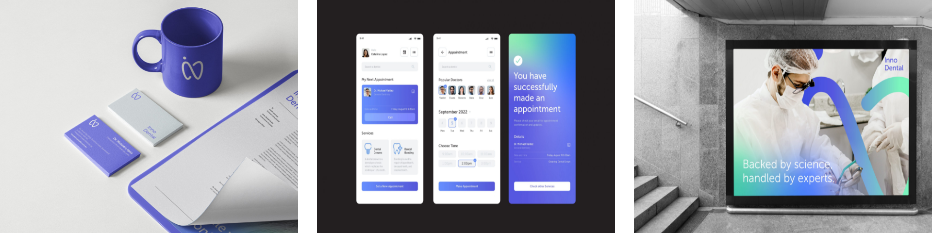
The overall design conveys a skillful proficiency, boldly expressing the expertise of the business, while also creating a comfortable atmosphere for its customers. This helps build trust in the brand, as well as grow its reach and influence. It says, “this is not just any ordinary clinic,” and anyone with a refined eye can tell.
The branding utilizes a neat color palette consisting of blue, green, and white. The dynamic blue represents the brand’s professionalism and trustworthiness, while also expressing a calming image. The soft hue of the green reflects the significance of health, as well as a focus on innovation and creativity. The white is the simple standard, showing off a clean, modern look. These colors in harmony all encapsulate values that are important to Inno Dental as a professional medical practice that cares for its clients.
The logo incorporates three main elements: the text “inno”, the tooth shape, and the infinity symbol. It is a modern stylization that uses clean curves and a sleek form. The logo can be shown in a plain white, or with the colors blue and green subtly gradating into each other. Overall, this logo signifies the commitment to the continuity of health and innovation—a simple yet creative statement that reflects how Inno Dental is an industry leader and trailblazer in the field of dentistry.
The design is versatile: a modern and functional look that is vibrant and full of life, whether on physical applications or in digital solutions. Appealing and accessible, innovative and inspired—it is a design that perfectly epitomizes the ideals of the brand itself.