Foreform Design
With the fast pace and high pressure that is ever-present in the modern workplace, efficiency is everything for companies that want to achieve maximum productivity. Using the adage “More Projects, Less Time™,” Forefront Design aims to provide the workspace products that most effectively support their clients in accomplishing this goal. A2 Design Lab worked to clearly reflect this philosophy into the company’s visual identity and online presence.
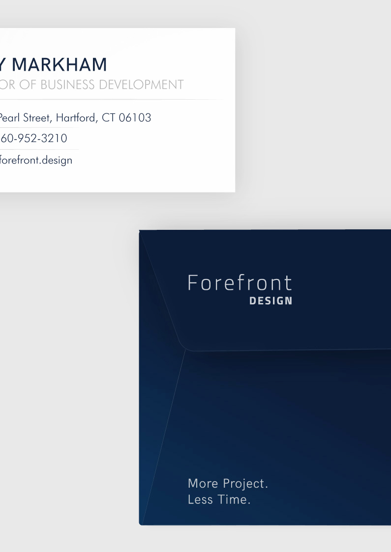
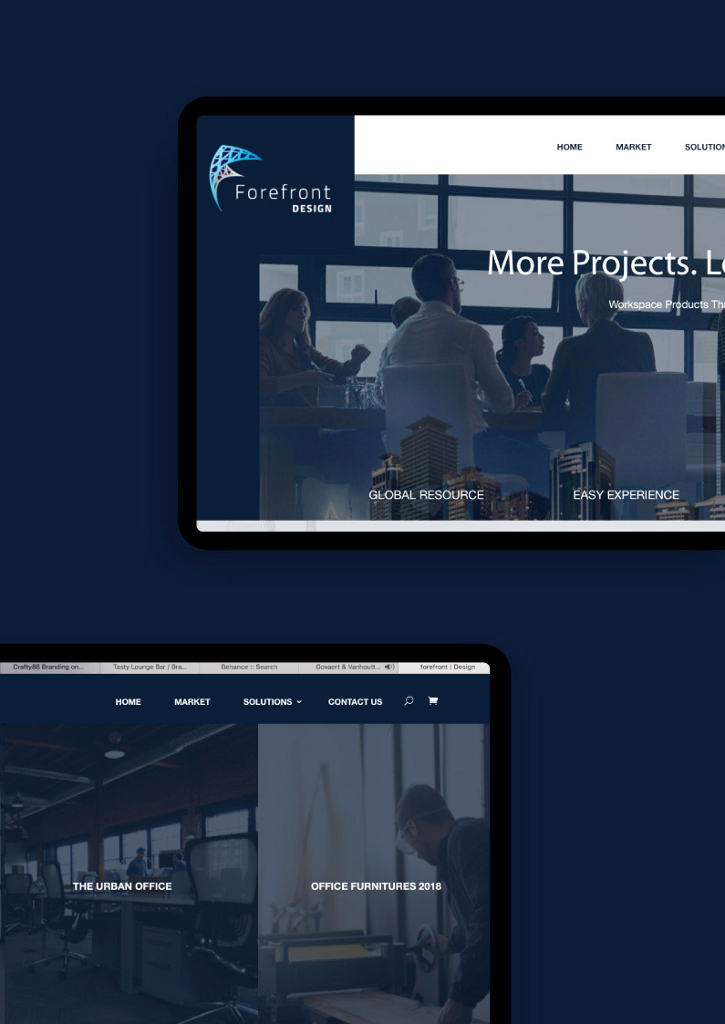
Just like its name, the new design brings the company’s strengths and values to the forefront. The branding uses a simple color scheme of blue and white: a clean and straight-to-the-point palette that is pleasing and professional. The logo creates the graphic of a construct of interconnecting lines shaped as the letter F, with the greater half in blue serving as a foreground—representing a focus on the connections of being cutting-edge and efficient. The entire website is designed to be very easily navigable while providing as much information as is necessary—all of which are design details that observe and exemplify the company’s “Effective By Design™” principle. A2 Design Lab’s work for Forefront Design successfully captures the essence of their mission—empowering businesses to achieve greater productivity through smarter workspace solutions.


